Many fellow filmmakers I worked with always asked me how I achieve a certain look with a certain film. More specifically the million dollar question “How do you color grade?”. This is a difficult question because of the process simply different every single time. I will be honest with you, there is no perfect answer to this question, as if you know what you are doing, you can do whatever and create whatever tone you want with any well-shot footage to a certain degree.
With this in mind, with my DP friend Kevin(check him out at here) shot most of the footage I will be showing, marks the first post in many more color grading shenanigans/explanation to come. First thing first, if you want your footage to grade nicely, shoot it nicely. Grab a good DP (a.k.a Kevin Nguyen) or improve your shooting skills. You cannot just shoot garbage footage and think you can fix it in a post. Many people thought the coloring process determines how their stuff looks.
As the colorist, you “influence”, you don’t “create”. Go grab some sample footage from RED to test as they are free. With this out of the way, the main course for this blog. This shot from the documentary “In Bardo”. More like an overview of it.
ALSO, I RARELY USE LUTS. Don’t ask for LUTS because I don’t use them. If you use full-blown preset luts (Ahem M31), I will reach out from your monitor and grab your neck. Just saying.
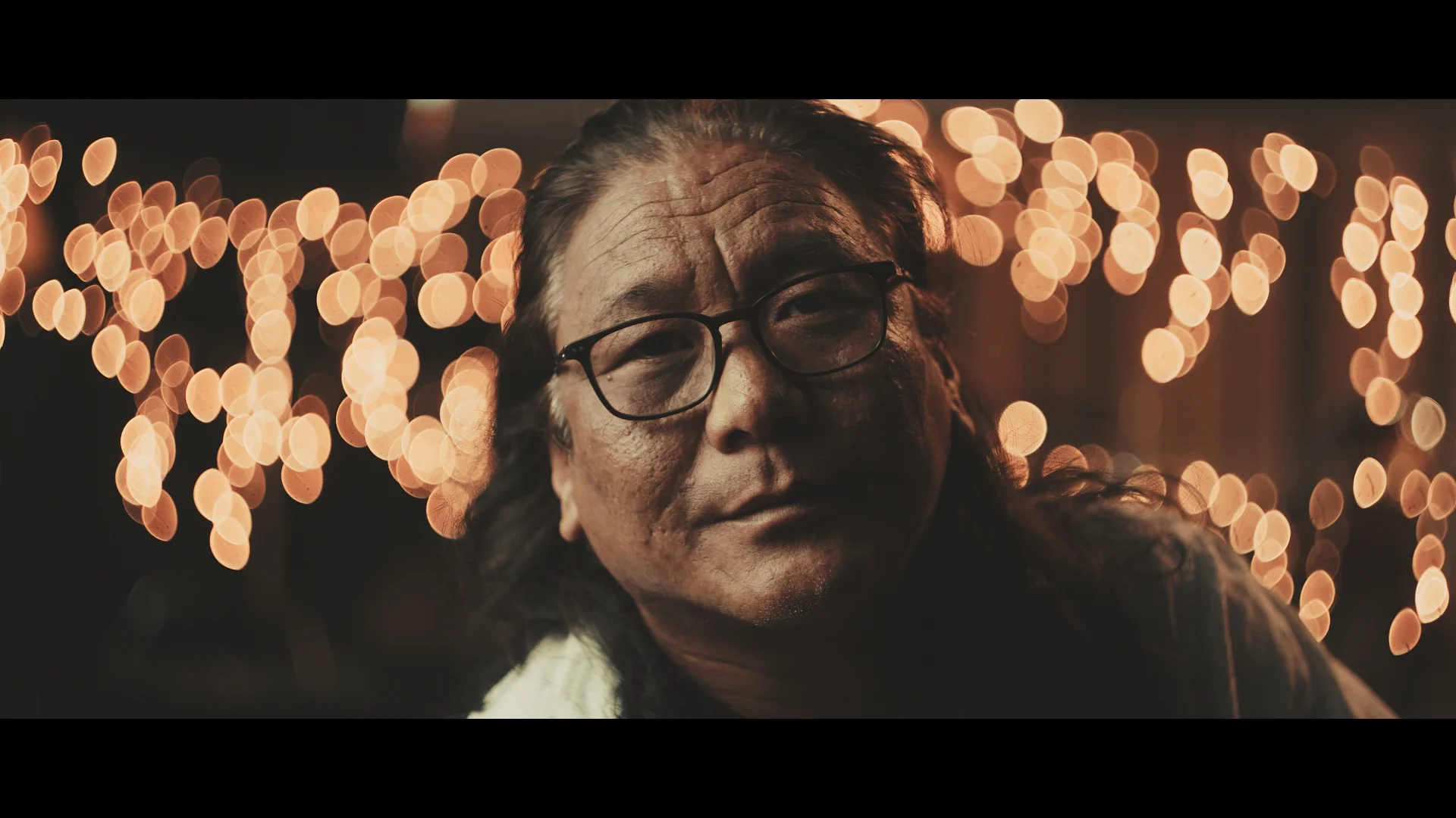
What you see here one of the master shot from the documentary. The shot alone has a lot of character and it contains the mood of the film and that’s the reason this shot has been chosen for the master shot. Before we start, we will need to see the ungraded version

Ungraded, Slog2/Sgamut.cine footage
As you can see this ungraded look already contains the basic form of the shot. The colors are there. Neutral Skintones, Orange-yellow bokeh balls. One thing I have to stress again and again, what you shoot determines the mood and the color tone of your shot. You can influence it a lot but not straight up “create something that it is not”.
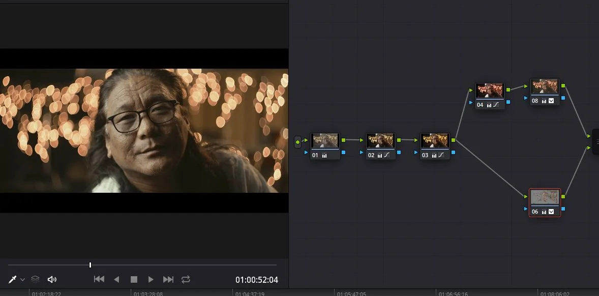
Let’s see the node tree shall we?

Node Tree of this shot
Looking at this after half a year has passed, I can tell you right now I don’t know what each node is doing to the footage just by looking at it. All I can tell you right now is this follows my traditional color grading flow. As I self-learner myself, I do not know if other colorists use this exact same method so don’t go around throwing “That’s INSERT COLORIST NAME HERE technique, you stole it !”
The grading flow I follow is Normalize-Coloring-Tuning. You can see by the node tree is clearly separated into 3 parts. Node 01, 02 ,03 is normalize, 04,08,06 is coloring. Tuning is 07,10,09. I will be talking about these nodes later down the line because all of them is their own process. This post will be kept simple for the sake of introduction.
From the process, you can understand what each of the groups is doing. Since the footage comes in log format, we have to normalize it to our viewing of choice or else you’ll be seeing grey most of the time and most of Resolve’s tool just doesn’t work because the colors are simply “too similar”.So what you do right now, is twist the gamma and contrast, so it looks good in its basic form.

Only 01 02 03 is active
You can see how it already looks decent without anything fancy. The first few nodes are just basic curves and contrast with a hint of Saturation. This is very important because if the shot doesn’t look right here, it will never look right afterward. You simply cannot move on without a baseline that is satisfactory.
It still a far cry from the final image but this first step is more important than the step that Armstrong took on the moon.
After you get something satisfactory, you screw with the colors. This is where 80% of the magic happens. When you put that Hollywood blockbuster teal and orange look, or whatever you brain says you want to do.
What I did here is hue shifted the fairy lights bokeh so it is orange to fit with the color I have in mind, something more zen and Tibetan-like as the main character is in fact, a Tibetan. Added some greenish teal tints to the highlights and separated his skin so it doesn’t get all messed up by the color tweaking.
One tip I have is that people can pick up garbage skin tones extremely easily, as we humans evolve to pick up signs of infected humans so we can run away from them.So make sure you babysit your skin tone so it doesn’t jump out.
After the color section, comes the tweaking section. The last 20% of the creative process.

You may not see a major difference. But there, in fact, there are differences as a result of the tweak.
Blacks have been lifted and hi-crushed to create that matte effect, lum vs hue curves has been deployed to combat color tinting in the shadows and highlights. Sharpening is also added to bring out the details in the skins. Tweaking is the refinement of the grade. Here usually you control how the blacks behave, how the curves behave and how the color behaves under different situation here.
Why not doing this first you may ask, it is because the adjustment here applies to the final image and act as some kind of limiter so stuff doesn’t go crazy. And also to create less artifact because most of the stuff used here is going to influence the qualifier in a way that doesn’t benefit you so you may well as keep it for later.
All of that combined into the final image you saw above.
Easy enough….? I guess? No?
I wanted to end this blog here because this is just an overview of the color grade and some insight for people who never touch color before you have a taste what is going on next. If you have any more question feel free to comment down below. There is more to come so stay tuned!